About the product
Soulclick is smart online fundraising software for nonprofit organizations. The innovative no-code platform helps charities, clubs, and associations collect online donations more efficiently and successfully.
Main project goal
The main goal was to structure the design system, implementing variations of components and their respective states while ensuring appropriate naming.
Overview
A design system is like a toolkit filled with reusable components and clear rules on how to use them. It's a way to create consistency and order in design, making it easier to build different applications. At Soulclick, we needed this to scale up efficiently and keep things organized. So, I took the initiative and created the SoulClick Design System.
In this project, you'll get a glimpse of some of the components I designed for this system. But remember, a design system is more than just a collection of components; when done right, it becomes the lifeblood of our products, giving them a coherent and harmonious feel. Take a look at what I've put together below, and I hope you'll find it as exciting as I do!
Execution
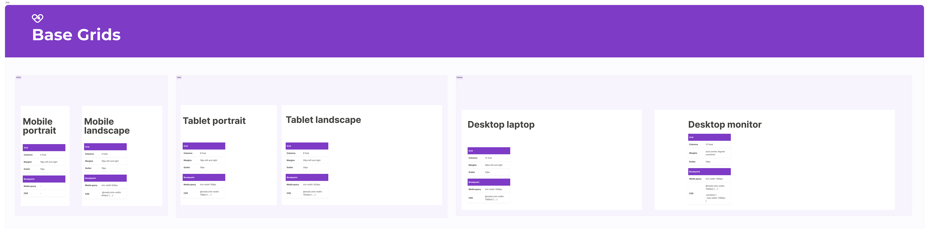
The foundation of a design system is your spacing and grid system. I feel like spacing and grids are some of the most overlooked elements when it comes to visual design, but they can make a huge difference in the look and feel of a design. For this project, I went with an 8-pixel grid system that consists of a 12-column grid and an 8-pixel baseline grid. For the spacing system, I went with a rem-based guide that aligns with the 8-px grid. The reason why I went with an 8-point system is to make the design system more responsive because all of the top screen sizes are divisible by 8 on at least one axis. This is important as it will help prevent anti-aliasing.
Typography
When selecting a font for the web, my aim was to opt for a font that's both neat and adaptable. I settled on Montserrat due to its geometric letter design and well-proportioned character spacing. Its exceptional versatility is another strong point, with a range of weights that make it equally suitable for headings and body text, contributing to an overall appealing look.

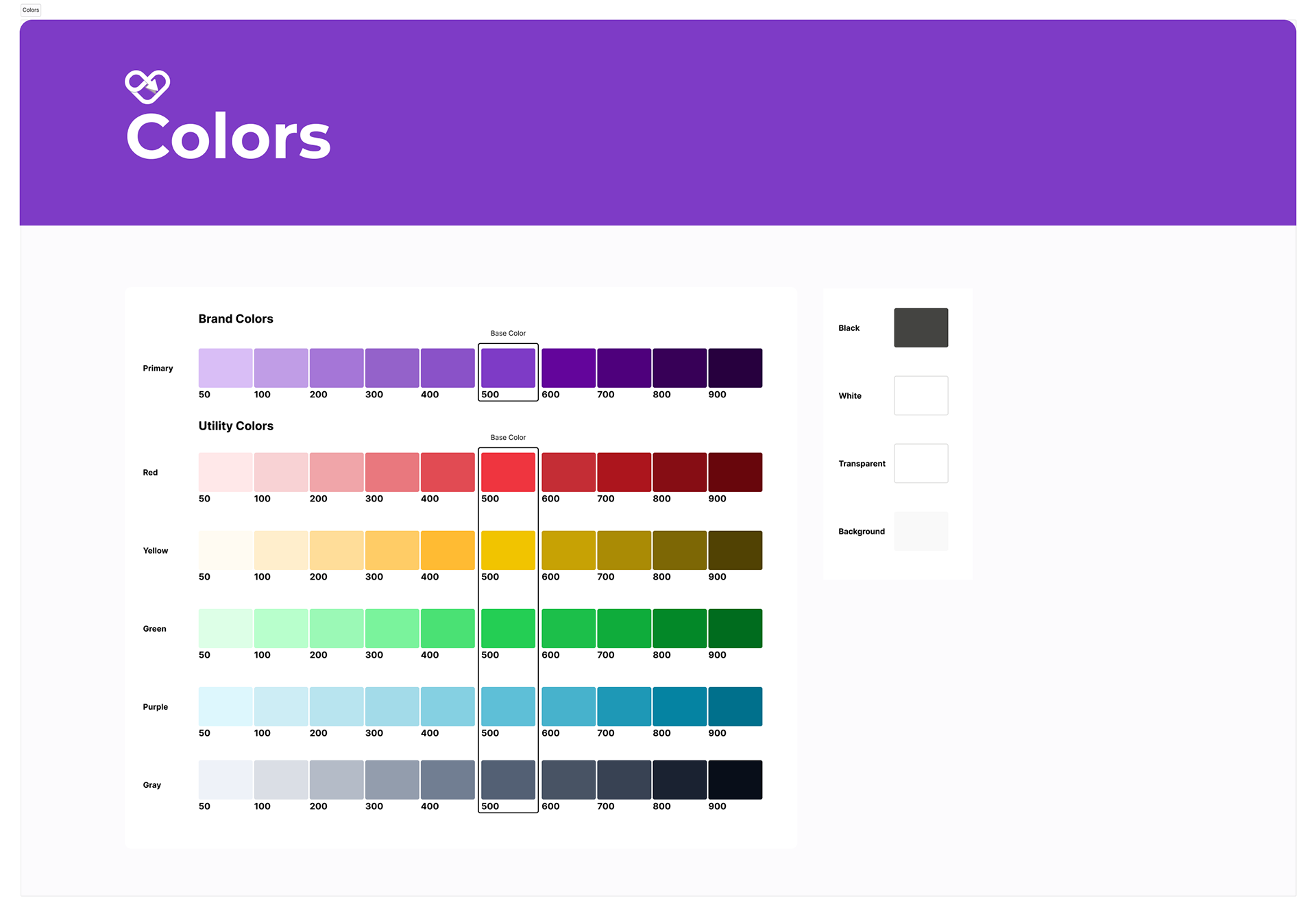
Color
Colors play a vital role in our content at Soulclick. We don't just pick colors randomly; each one has a purpose and meaning. They help communicate information hierarchy, interactive states, and distinguish elements. By giving colors specific roles, it becomes effortless to modify and customize our designs later. This consistent color system extends across multiple touchpoints, ensuring a seamless user experience.
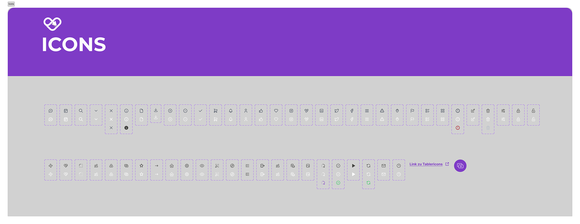
Iconography
Icons serve as visual tools that assist users in accomplishing tasks. In the Soulclick design system, I opted for the tabler icon library due to its straightforward nature, informativeness, and alignment with the overall visual style of the system. By choosing a simple icon set, I aimed to reduce the cognitive load for users. The emphasis on simplicity helps users grasp the meaning behind each icon and facilitates easy recognition, even on smaller screens.
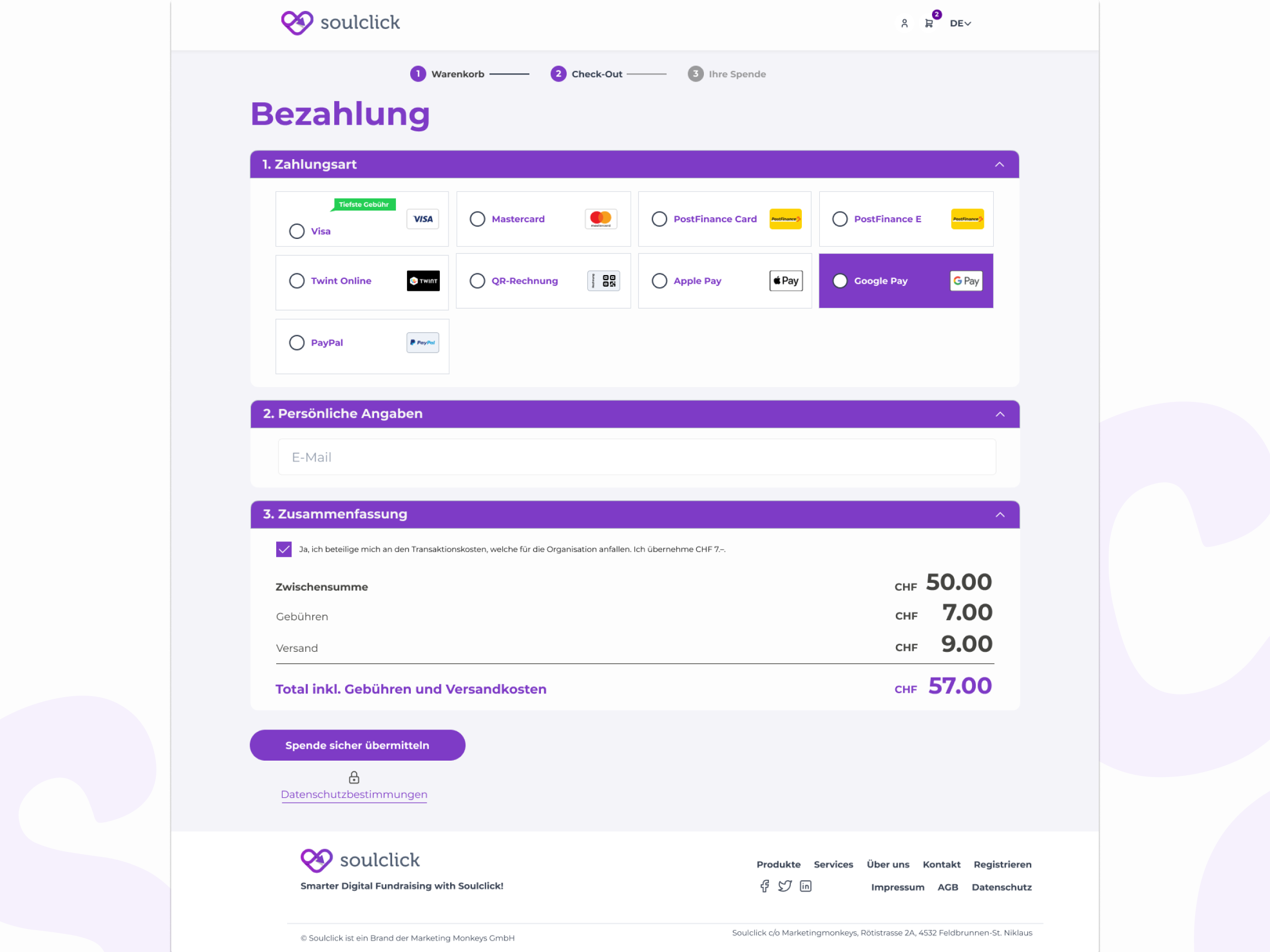
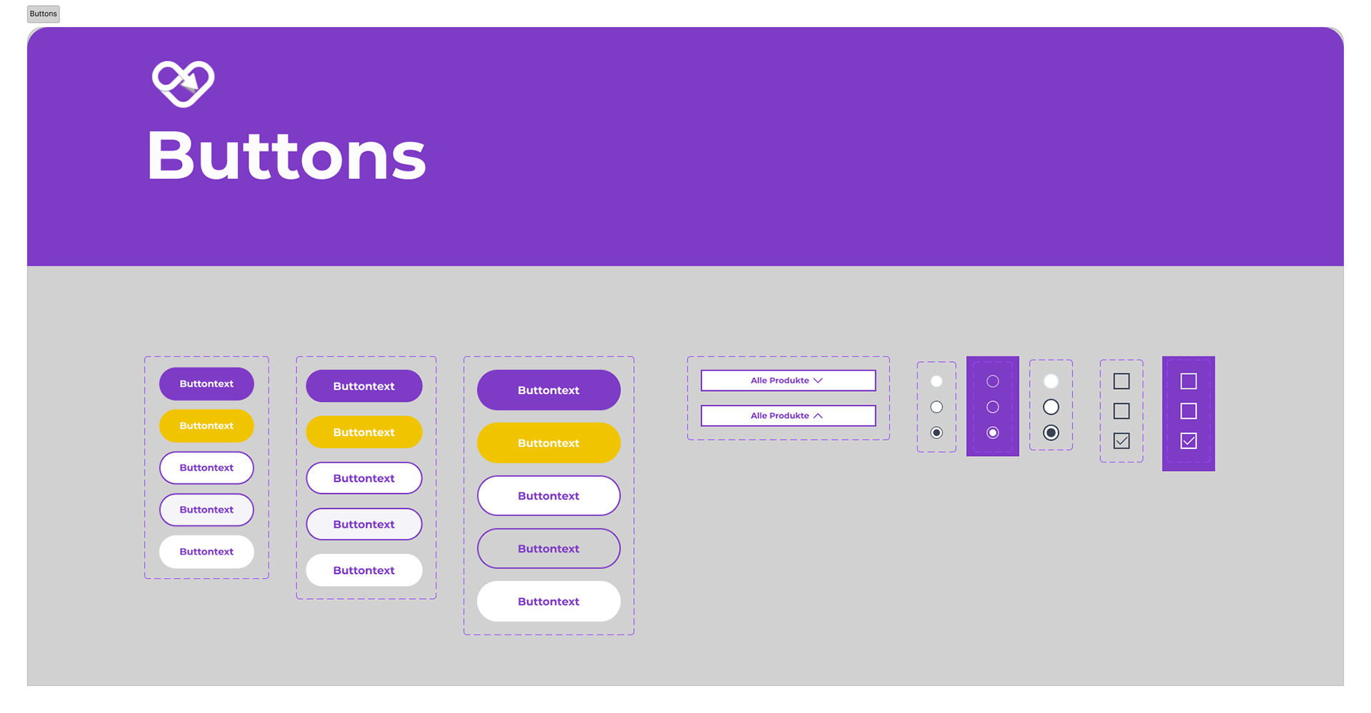
Buttons
While most people are familiar with buttons, non-designers often overlook the fact that a single button can have multiple states. These states typically include active, hover, focus, and disabled, each serving a different purpose in the design.
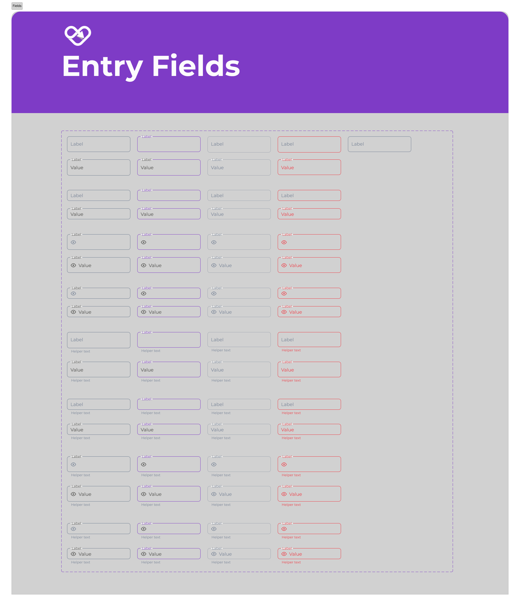
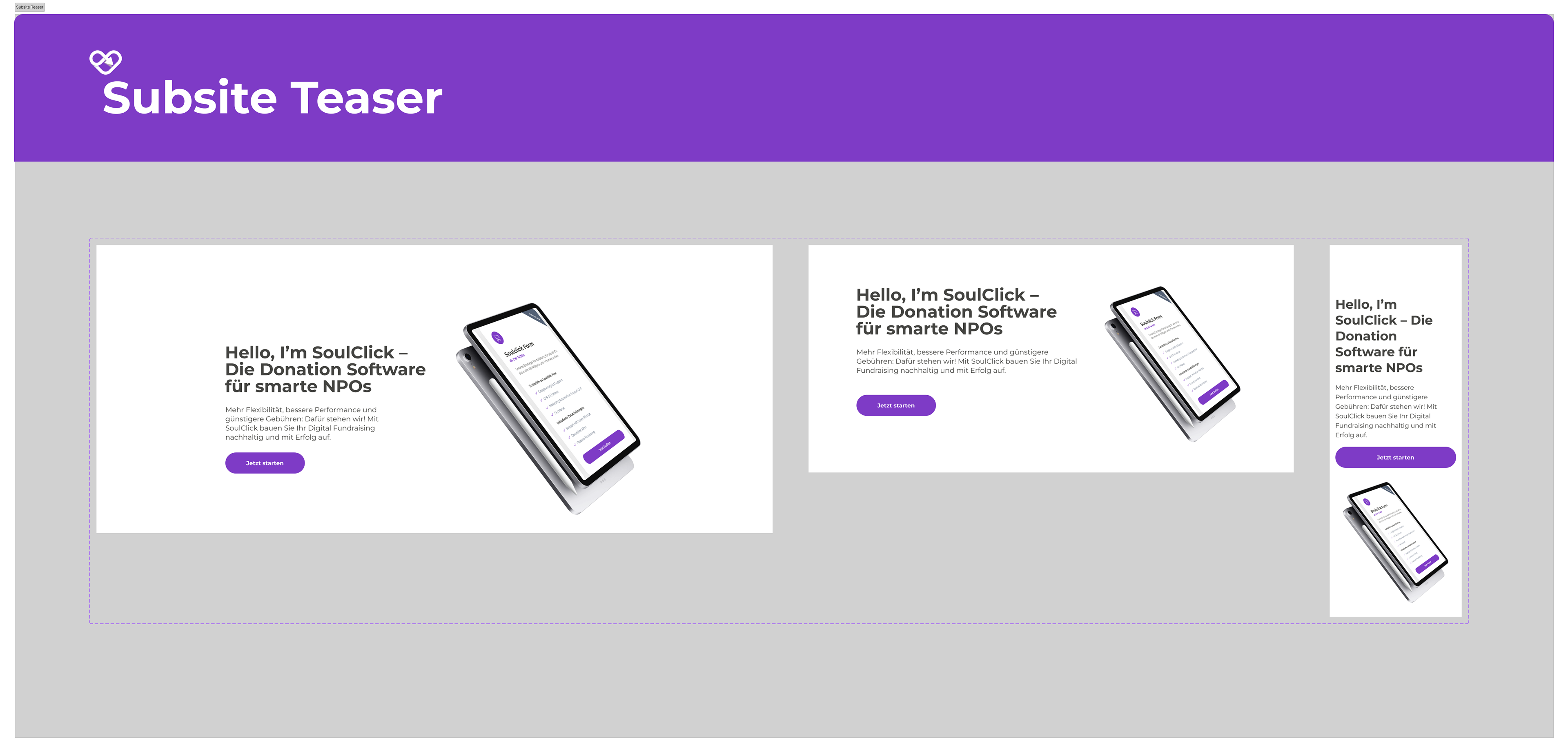
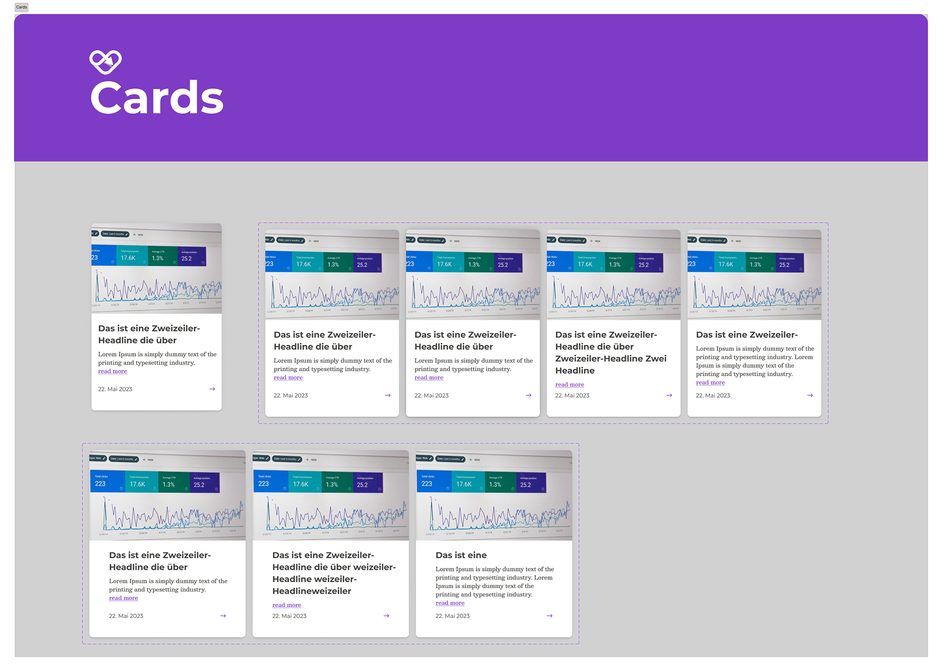
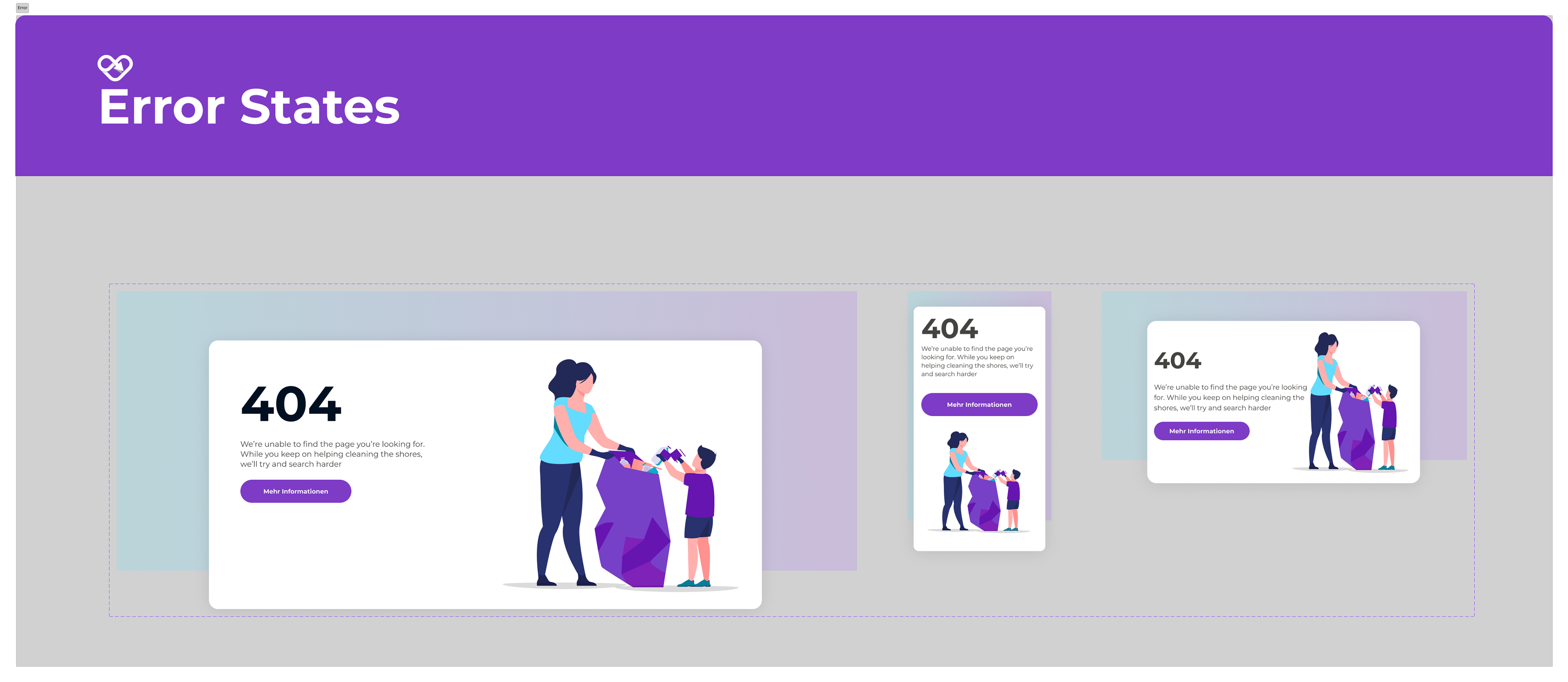
Other Components
Design systems can be intricate, and so far, I've only touched the tip of the iceberg in terms of components created for Soulclick. To complete the picture, I'd like to showcase a selection of other components I've developed to support the Website, Manager, and the Soulclick brand.
Results
Think of design systems as gradual processes that grow and change over time. They are complex and constantly evolving to meet the needs of the projects they support. What I've shared with you is just a small part of the whole system, like showing a single piece of a much larger puzzle. See the final web app: https://soulclick.ch/de/